
UX-Gigs Website Project


By: Irene Chong Ai Ling
ABOUT
THE
PROJECT
ABOUT
THE PROBLEM
Target Audience:
Avid UX/UI Learners &
The Public
Tools:
Figma
Our task is to design an online directory regarding a list of UX/UI tools and resources for the UX-Gigs' website. UX-Gigs would like to have a mobile platform for their users to promote and build knowledge-sharing of UX/UI Competences for the local community.
SOLUTION
Based on research, I have decided to use LATCH's Time and Category for Classification while for design patterns, usage of filter navigation, actionable result, Accordion, and Wizard to arrange the information provided.
UX Tools:
Moodboard, sitemap, UX Flow, Wireframes and Prototype
TABLE OF
CONTENT
01
PROBLEM
STATEMENT
02
SITEMAPS, FLOW DIAGRAM & LAYOUT JUSTIFICATION
03
04
WIREFRAMES
MOODBOARD, COLOURS, & TRENDS USED
MOCKUP & PROTOTYPE
05
01
PROBLEM STATEMENT
PROBLEM STATEMENT
UX Gigs, a non profit UX/UI community, aims to promote and build knowledge sharing of UX/UI competences for the local community. As a volunteer at UX Gigs, you have offered to help design an online directory for a list of UX/UI tools and resources for their website. UX Gigs is also keen to provide a mobile platform for their users.
02
LAYOUT JUSTIFICATION, SITEMAPS & FLOW DIAGRAM
SUGGESTED CLASSIFICATION AND DESIGN PATTERNS
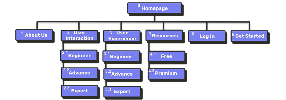
SITE MAP

FLOW DIAGRAM
Filtering through resources based on primary navigation (Selection: Free, Design)

-
Enter Homepage
-
Select “Resources” Tab’s dropdown button
-
Select “Free Resources”
-
Select “Design”
-
Process Complete
WIREFRAME
Deskstop: https://www.figma.com/proto/ocvDPrIreGxYELfw1JWTUT/UX-Gigs-WireFrame?node-id=293%3A2295&scaling=min-zoom&page-id=283%3A9554&starting-point-node-id=293%3A2295&show-proto-sidebar=1
Mobile: https://www.figma.com/proto/ocvDPrIreGxYELfw1JWTUT/UX-Gigs-WireFrame?node-id=293%3A2235&scaling=min-zoom&page-id=283%3A9554&starting-point-node-id=293%3A2235&show-proto-sidebar=1
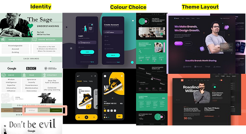
MOODBOARD
Style: Creative, Modern, Informative and Minimal

Fonts, Spacing and Colours Used

Color selection is based on brand identity, “The Sage” meets Modern as I would like the website to be easy on the eyes and to fit with the current trends
Main Font: Montserrat (San Serifs )
Headings (48-72), Sub Headings (30+), Texts (24)
I have chosen Montserrat as I feel that San Serif would be a great font to pair up with the “modern” and creative mood I would like the website to convey. I have only used one font as I wanted it to be minimal and sleek. I also feel that this font s expressive enough as it had a classy yet approachable font.
I have also based my font sizes through coursera.

.png)
.png)
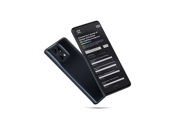
MOBILE
03
WIREFRAMES
04
MOODBOARD, COLOURS, & TRENDS USED
05
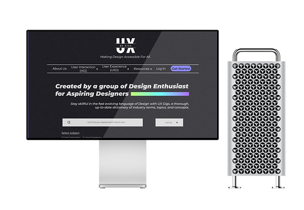
MOCKUP AND WIREFRAME